

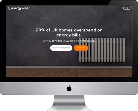
We were asked to refine the sign up process, to help people register on the EnergyWiser website and switch energy suppliers.
EnergyWiser are different from most energy comparison sites, as they want to stay with the user throughout the process and be there with the next good deal when their current deal finishes.
I was assigned as Team Mentor, which meant as well as all the normal UX stuff I had to keep the team organised and on time.
Date: October 2015
Duration: 2 weeks
In my role as Team Mentor, my first task was to plan out the project. While the rest of the team worked on competitor analysis, I worked out our timeline and set up the tools we would use.
The competitor analysis was split between energy companies, energy comparison sites and sites with good on-boarding processes, for instance Trello, Netflix and Dropbox. We also did a heuristic evaluation of the EnergyWiser site.

We met with our client, Rishabh right at the start of the project and I made sure to keep him up to date with the project as we worked. He had lots of information to share with us but also some strong assumptions.
We created a survey to find out what users really thought about energy comparison sites and to test if our assumptions were correct.
Our key insights from the survey showed that most people knew which supplier they were with but did not know off-hand their useage. It also showed their pain points, switching supplier or tariff had many issues including users feeling it is a lot of hassle and feeling very confused by the use of jargon on all the websites.
These results gave us an idea of what we would need to consider when re-designing the sign up process.
The survey also gave us users to contact for more detail. I interviewed several people in a mixture of face-to-face and phone interviews which showed me how users just do not have the time to look into switching when it was considered such a small saving. And we found the real problem - users do not trust the energy companies or comparison sites.
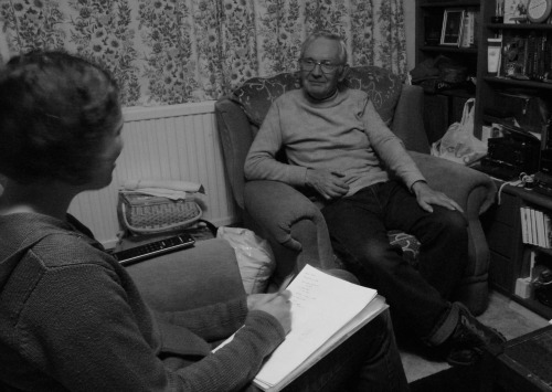
At this point we reframed the problem we were trying to solve to ‘create a frictionless, trustworthy and understandable sign up process’, as we realised that it was more than just the sign up process that needed to be worked on.
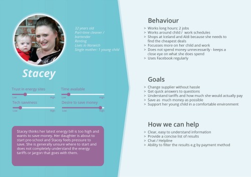
With all the research we had done to this point we came together as a team to create three personas. Amit, Stacey and Bernard represent the groups of users who might use the EnergyWiser website. Stacey is our main persona. If we can help her then our design should help most other users.
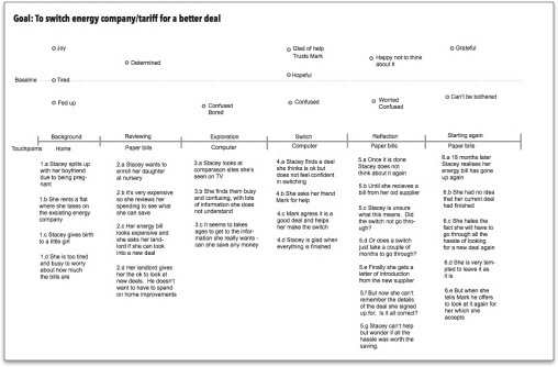
While the guys created task flows for users like Stacey to see how she would use the site, I created a user journey map for Stacey to see what her journey using comparison sites is like now and where the low points are so we could address these issues in our own design. A journey map is not just about the website; mine started when she moved into a new flat and took on the energy supplier who was currently supplying that flat.
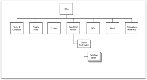
Although we were working on the sign up process of the site, from our research we knew that trust was a huge issue. Therefore we started to think about what could help. We realised that more information about what EnergyWiser was all about, along with a set of FAQs would help to make people more at ease when using the service. We created a site map to show the relationships of these pages to each other.
Reaching the end of the research phase we got ready to start designing. Firstly we individually wrote down any thoughts we had about the research we had done and the brief. These were stuck on the wall and as a team we moved them about to create an affinity map. These collections of post-its covered anything from how to gain the users trust through to the individual questions we would have to ask the user to give them a meaningful estimate of what they could save. They gave us ideas for our design principles and features for the site.
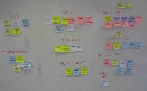
We listed the features out and prioritised them so we knew exactly what we would be working on.
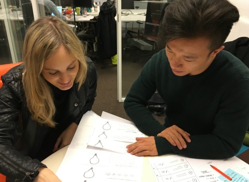
At the end of the first week we ran a design studio. A design studio is a great way to generate ideas quickly and involve people in the process. We did this with our client and his team at their offices.
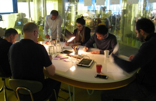
I facilitated the session, making sure everyone knew what we were doing, keeping time for each section and making sure everyone got to present their ideas to the group.
This was a fun exercise which everyone really enjoyed once they got started. Being able to draw is not important - getting ideas down is. The session ran for two hours and by the end of it we had piles of paper covered in sketches.
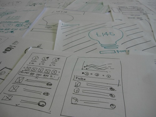
Using all the ideas generated at the Design Studio and with Stacey's persona in mind, we started sketching out ideas for the new site. And after lots of discussion and more sketching we came up with our first paper prototype. This allowed us to test the flow of our design with users before making our first clickable prototype. We created rough wireframes in Omnigraffle then loaded the images into Marvel App to make a site a user could click through.
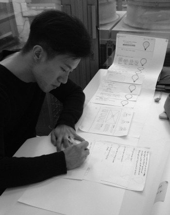
We made many changes to our design, always testing with users after each iteration, but there were two big changes.
Originally we had placed the first set of questions in an accordion on the homepage, but we struggled with the user flows. When we moved these questions to sit on the results page along with the extra four questions which will give the user a more accurate result suddenly the flow improved and users found it very easy to use.
The second thing we did was to remove a section of summary text which made the user click twice before seeing their results. This again improved the flow and made it even easier for the user to get to the results, something which we had found could be quite hard on some of the competitor sites.
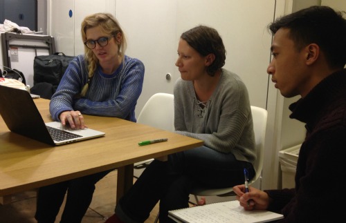
Now we had a flow which we knew worked, Zhenjie and Ben did research on what colours worked best for trust and confidence and tested the results with users by doing a word association exercise. They gave the users a selection of words and asked them which mocked up design matched which words.
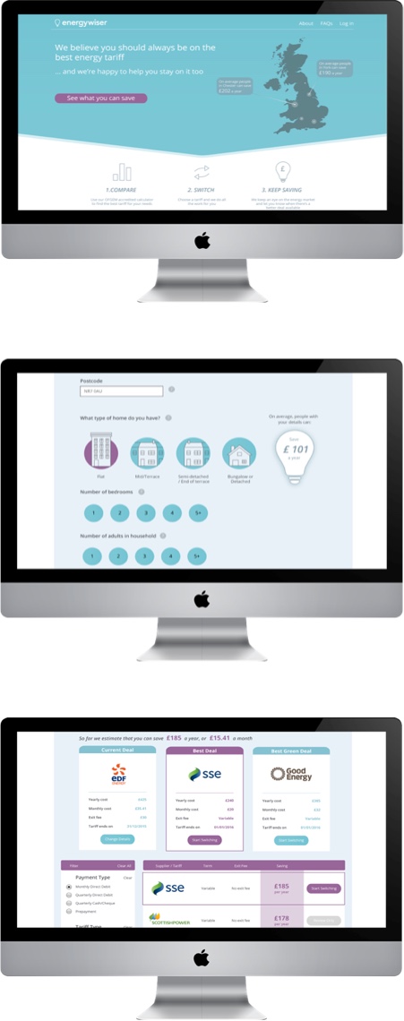
Zhenjie then turned the mock up with the best responses into a high fidelity design which looked beautiful. When we showed Rishabh he was very happy. So happy in fact that he used our design on his live website and then continued working on the design with Ben.
“Coming in completely cold to this industry and to turn around designs like this within two and a half weeks is no mean feat”
Rishabh Arora
Founder, EnergyWiser
The whole project had been about creating trust and so from the research we had some recommendations for EnergyWiser in addition to the refined sign up process.
This project was part of the General Assembly 10 week full time User Experience Design Immersive course.

If you have any questions about my work please feel free to contact me.
Email me on peneloperance@gmail.com or find me on Twitter or Linkedin.
Sign up to The UX Life Chose Me Newsletter and get the most interesting UX Research articles, videos and podcasts from across the web straight into your mailbox once a month.