

With the successful launch of our v3 mobile app for Metrolink, allowing people to buy and use train tickets on their mobile phones across Los Angeles and the surrounding area, we were finally ready to migrate Thames Clippers from v2 to v3. This would up-grade the current app which allows people to buy and use tickets on the Thames Clipper passenger boats which travel up and down the River Thames in London.
Although a lot of the screens within the app would not be changing that much I was asked to work on the live departures screen which allows users to see when the next boat is leaving a selected pier.
UX Designer
Date: May 2016
Josh May
Project Manager
Joe Weaver
Danny Marsh
Front End Developer
Having been asked to have a look at the live departures screen I started by doing some research, looking at how it worked on the old app, a little cul-de-sac of a screen which holds useful information about boat times but makes you return to the homescreen (two taps) to then buy tickets.
Josh had already raised the idea of adding the functionality for buying tickets directly from this screen, which I thought was a good idea.
I also looked at the Thames Clippers website to get a better idea of the sort of information they supply about their boats.
This made me think about how to make it easy for someone who does not know the service very well to work out where the boat is going.
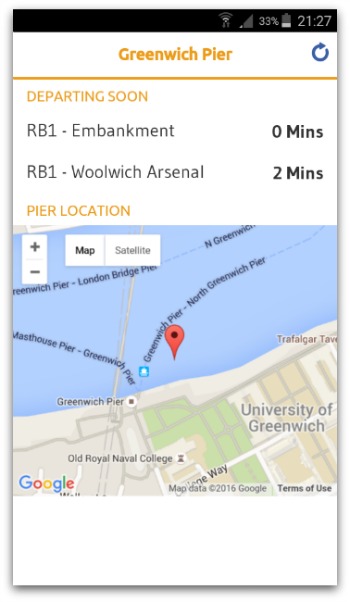
In the old app the screen would tell you the route number, where it was going and when it would arrive at the pier you had selected from an API supplied by Transport for London (TfL). A google map helped users to orient themselves for their selected pier.
However being new to the app I was a little confused about some of the information being displayed and felt that new users might have the same issues, for instance finding route numbers or working out which direction the boat would be travelling in.
Next I looked at ways this information can be displayed. Looking at competitors also helped here. How do other apps or transport systems help people to navigate? It was while looking at how TfL do this that I started to come up with my idea.
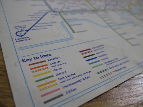
So I started to play with the idea of using colour and direction to help people work out which boat they need.
Without adding too much extra clutter to the screen, by using the new style of having cards of information, I came up with a simple design which split the boats by direction and used the colour of the route with the route number.
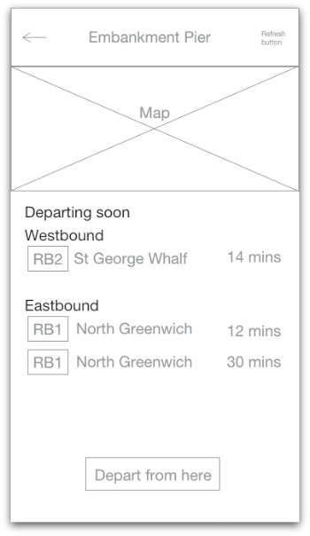
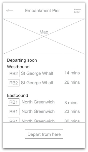
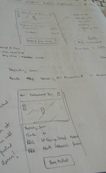
I also added a button to the bottom of the screen allowing users to buy a ticket directly from this screen. I had to think about the text for this call to action, as well as look at the flow - what would happen when a user clicked on it?
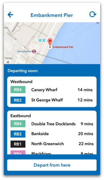
Although ‘Buy Tickets’ was an obvious call to action, we use this text elsewhere in the app and it normally means you are starting at the beginning of the purchase flow. By clicking this button the user is skipping the first step in the purchase flow and I wanted to make sure this was clear. So I used the text ‘Depart from here’ which should allow the user to see which pier they will be departing from and hopefully be less confusing when they step into the purchase flow mid-way.
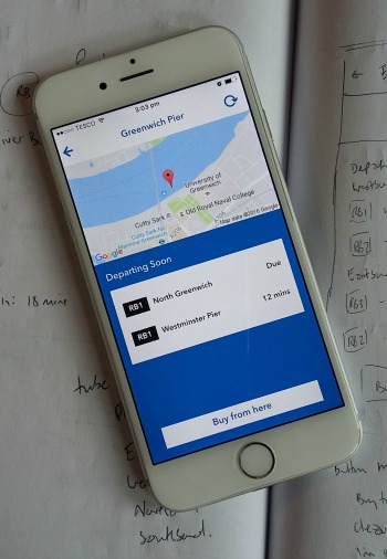
However when the team at Thames Clippers saw this they asked if it could be changed to read ‘Buy from here’. Without the option to test this with users I have no way of telling what wording works best so the text was changed, a compromise for the best I hope.
The button placement was easier as I followed the convention of our app which is to have the button at the bottom of the screen making it easy to click even if using your phone with one hand.
From my sketches I created wireframes which Joe then tidied up, adding the correct design colours and elements from our templates bringing the design into line with the rest of the app.
Joe also added a design for when there were no boats departing from the pier you had just selected. His design matched similar 'error' messages across our apps.
We then took the design to Josh and Danny.
Although I had been informed the API would contain all the information I would need for this design, when Danny investigated further he found that information regarding the direction of travel was not easily available. He could create a hack to make it work but this would leave the app vulnerable to changes to the API in the future, meaning the page could end up broken. We decided it was better to amend the design instead.
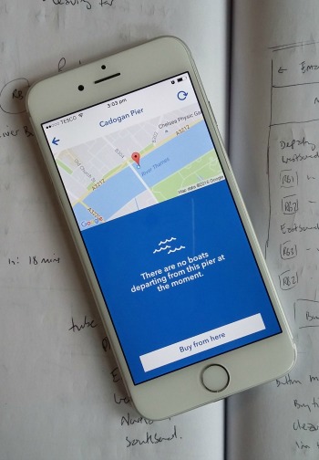
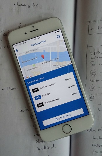
I modified the design bringing the two sections together but keeping the rest of the the design, before Danny built it.
After some issues with the placement and sizing of the button at the bottom of the screen were corrected, it was ready to be deployed with the rest of the app.
Although my design went down well in the office and with the team from Thames Clippers, I have not had the opportunity to test it with real Thames Clipper customers. This, along with the analytics now the app has been released will help me to see if the changes we made have improved this part of the app or not. And most importantly if anyone is using the ‘Buy from here’ button.
If you have any questions about my work please feel free to contact me.
Email me on peneloperance@gmail.com or find me on Twitter or Linkedin.
Sign up to The UX Life Chose Me Newsletter and get the most interesting UX Research articles, videos and podcasts from across the web straight into your mailbox once a month.