

Post Office has over 11,500 branches across the UK and our job is to support our postmasters to run successful businesses.
At one of our regular Customer Experience meetings, Simon Phillips talked about a project his team in Marketing were running to create a portal where postmasters could create and order personalised marketing materials for their branches.
This would help them support their communities better with relevant posters and leaflets and cut down on waste as they would be able to order only what they needed. I got in contact with Simon to ask if he had tested the portal with postmasters and if not told him how I could help.
UX Researcher
Date: March 2021 - September 2023
Duration: 9 months
Project Owner: Simon Phillips
My Ly
Project Manager
We were in COVID lockdown when this project came up, however I had just been given access to UserTesting.com and had been learning how to run remote tests with Post Office customers across the UK.
This would be a new challenge as it would be with our own staff, so a slightly different journey than using the UserTesting panel.
Once I had spoken to Simon and explained how I could help, I then had to find some postmasters to talk to.
We have various gatekeepers who I had to work with to contact postmasters. We also had some constraints over which postmasters we wanted to talk to. For instance the trial platform would be rolled out in only one region so we wanted to speak to postmasters in this region.
When setting up sessions I also had to remember that postmasters are very busy running their branches, some have more than one, and so sessions in the middle of the working day were not always appreciated. I made sure to offer times throughout the day and into the evening to allow as much flexibilty as possible.
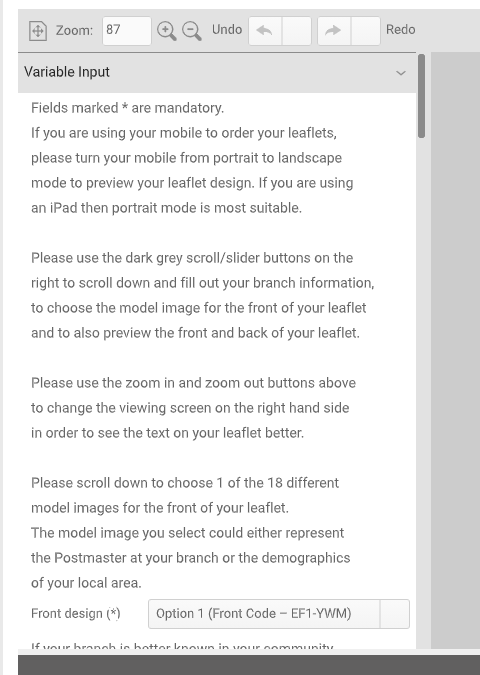
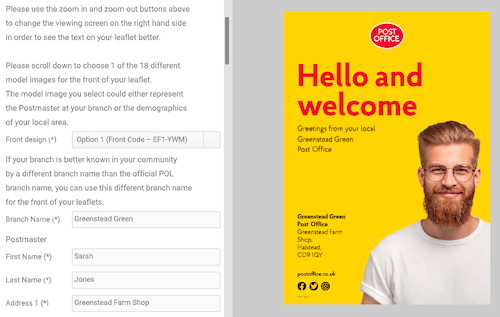
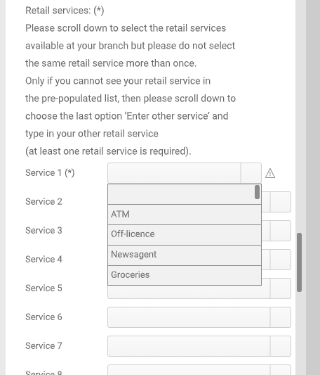
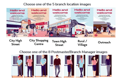
Simons team had been working with an agency to create the portal, and I had a little play before writing my test script, keeping in mind the main things Simon and the team expected postmasters to do, namely to edit leaflets to include details of their branch and then order a set to be delivered to them.
With the postmasters scheduled, the test script written and the promise of no downtime with the portal while testing was running, we were good to go, with the team watching live.
The testing itself was a little bumpy as we had technical issues and late arrivals, but we had some really good sessions and it became very clear there were many issues with the portal.
The main issue was that the portal worked well if you spent most of the day in front of a computer, however if you actually spent most of your time in branch speaking to customers face to face it was a lot harder to use.
It also didn't work on mobile, postmasters main tool for day to day use.
There were all sorts of other issues but I think we could all see that this wasn't the right approach.
I wrote up my report and presented back to a frustrated team. I said that I'd be very happy to test it again once they had made amendments, and left the report with them.
I didn't hear back for about nine months and wasn't sure what had become of the project, when Simon reached out and asked if I could do another set of tests. Of course, I said.
In the time inbetween, they had dumped their first build and started again from scratch using my findings as a base.
I went through the process again of finding postmasters to speak with and finding times that worked for everyone, before running the same test script as before.
What a difference nine months made. This portal worked on mobile. It was easy to use and even the postmasters having technical difficulties could use it.
Although there were still a few issues to iron out, my report this time was much more positive!
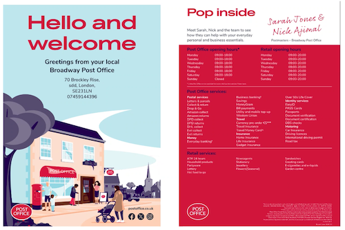
With a much more positive result this time, the small issues we found were fixed and the portal was finally released to the first batch of postmasters.
So far they have been very positive about the portal, finding it easy to use and providing them with much needed personalised materials to use in their branches.
The portal has now been released to all postmasters to use, and Simon is aware that I'm happy to help with testing if they decide to make any major changes going forward.
If you have any questions about my work please feel free to contact me.
Email me on peneloperance@gmail.com or find me on Twitter or Linkedin.
Sign up to The UX Life Chose Me Newsletter and get the most interesting UX Research articles, videos and podcasts from across the web straight into your mailbox once a month.