UXDI Week 6: 5 - 9 Oct 2015
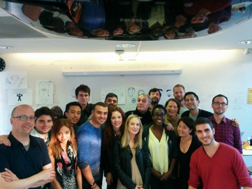
Week 6 was all about Visual Design and after the last 5 weeks it was a nice change. There was still much to learn, but it was a little less intense.
Andrew was taking a back seat this week as Tricia was running the class. She’s from America and has run the UXDI course in New York and London so knew exactly what she was doing.
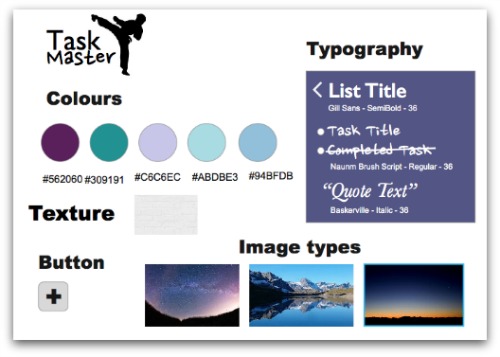
The aim of the week was to take our app designs from Week 1 and make them look nice. To do this we used a programme called Sketch (although some people stuck with things like Photoshop if that’s what they were used to).
Not only could we make our old designs look nice but we could fix the problems which were now obvious to us after 5 weeks of intensive UX training.
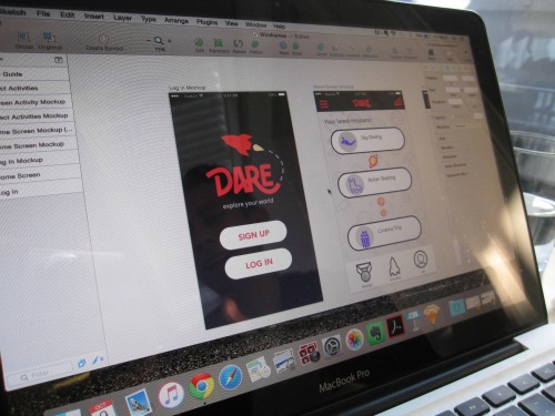
I was sitting next to Dan this week and was intrigued to watch him create his rocket icon for his app. I’m new to visual design and Sketch so I’ve been learning as I go along, but I’ve learnt lots from just watching what he’s been doing and asking for help when needed from the guys who have visual design backgrounds - particularly Dan and Stratis. Thanks guys. The TA’s Tom and Mollie were also invaluable resources.
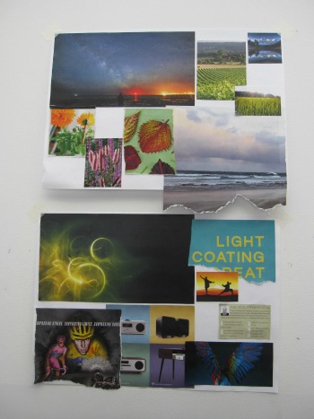
We also had a field trip out to the Design Museum to look at the Design of the Year nominations. The range was amazing, but I did find myself drawn to the designs which aimed to improve life by filtering city air, removing plastic from the sea, or responsive street furniture which helps disabled people, amongst others. It was nice to see Monument Valley (see week 2) nominated!
And as we aren’t going to present any projects in the next couple of weeks, we were asked to do flash talks (2 a day) - 5 minutes on a subject we’re interested in. I had the privilege of going first on Monday afternoon, so put together some slides on making paper (what else?!). The photos from my creative blog came in very handy. I made sure to take some samples with me too which everyone loved!
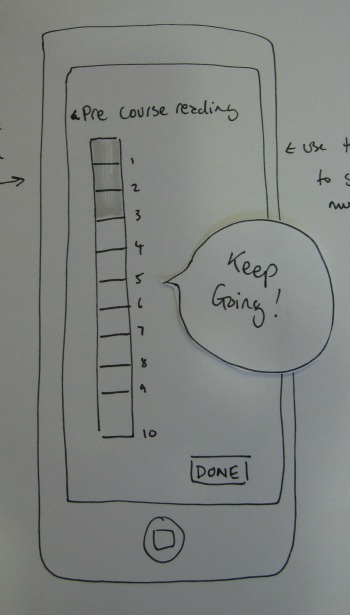
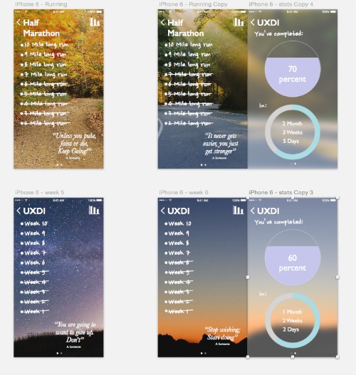
So all in all a very satisfying week. It was amazing to see the metamorphosis of my grey design of week 1 into a beautiful colourful butterfly. It’s hard to even recognise it. I’m still no visual design expert but maybe with a little practice I can do this.
[Originally posted on my creative blog - Wild Creations]
