Get the Picture - Introduction to Infographics
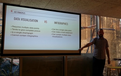
This week I was back at General Assembly to learn about Infographics in an evening session run by Alan Rutter from Clever Boxer.
As a UX designer I often have information that I want to share with my colleagues but I know they will not read any reports I write, I will be lucky if they read an email (just because they are all really busy). So I thought an Introduction to Infographics might be just the thing I need to help me put across important information at a glance.

As Alan said we are now exposed to more data than ever before, and raw data is not easy to understand. So our job when creating an infographic is to convey information in a clear way.
He started by giving us some basic principles, the key point being we should be telling a story with our infographic and we should keep it as simple as possible, only adding things if they add to what we are trying to say.
"We are exposed to more data than ever before"
He also gave us a four point design process for creating each infographic.
- Audience: First who is the audience? You need to know their level of knowledge, where they will see your infographic, and what outcome you are looking for.
- Message: Then you need to know the message you want to pass on and sum it up in one sentence. What do you want to hammer home and what can you leave out.
- Action: Next think about the action you want them to take. Do you want them to give you money (stakeholders) or stop smoking?
- Design: And then you can think about the design. This is where you really push your message and make sure it fits your audience. And if you have two different audiences Alan suggested creating two different Infographics.
He then gave us some design tips and shared some tools which can help, although it sounds like there is no one tool for everything and you need to play with them and see which works best for you. He said it is often best to start with pen and paper and really work out what you are trying to say first.
But the main point was making sure you have clarity about what you are trying to say and do not just decorate.
It was a really interesting evening and I hope to be able to put some of it into practice sharing information with my colleagues, but maybe also in other places too.
