Small Jobs - Device Switching
I recently read somewhere that small projects can be more work than big projects but with less pay, and although I have worked on all sized projects and know this to be true I think one of my recent projects shows this well.
I have only been with my new company a couple of months, but have already worked on a variety of projects. This has been great and helped me to learn about the business really quickly. There are just three of us in the design team and we work closely together on projects across the business.
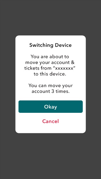
A couple of weeks ago we were asked to look at adding some functionality to a part of our app which is already built. Customers can only use our app on one device at a time and each time they log in to it on a new device they use a 'device switch'. In an attempt to stop fraud and to keep our customers payment details safe they only have 3 switches, each of which are then replaced 6 months after being used.
If they have used all their switches but maybe lose their phone and need to log in to their new phone they have to phone up for a complimentary switch. This was the bit we were tasked with adding.
Small job right. You just need a pop up screen telling them they are about to use a complimentary switch. Easy.
But was that really the case? As I started thinking about it I wondered if the user would care what sort of switch it is. You have phoned customer services, they have said you should be able to log in now, and when you try and log in this time it works. Who cares what sort of switch it is or how the back end logic works.
"Our message just made panic and confusion, the exact opposite of what we were trying to do"
But what about if you have still got switches and you lose one accidentally, maybe your kid is messing with your phone (I am not convinced by this argument, but let's go with it). Again when you phone up about it, all you want to know is you have got it back, not how the back end is going to fix this for you.
Speaking to my colleagues about this they agreed. So all we had to do was a small correction of the current wording so the user would understand how many switches were left, as this was a bit confusing. Sorted.
As we do not have access to our users, being b2b, we have started doing small testing sessions with colleagues across the company. Just an hour a week trying out our designs. So we mocked up our screens and stuck them on a phone and tested them.
"You've just received a new phone and try and login to your account and see this message. What do you think?"
The results showed us that we were not even close to fixing the problem. Forget the complimentary switch. Our users did not know what all this switching was about! Why was there a limit? Could they only switch device 3 times ever? Our message just made panic and confusion, the exact opposite of what we were trying to do.
So we sat down and tried again.
We wrote down what we needed to tell our customers in long form. We worked out what should be on our pop up and what we should put on a longer 'more information' screen. We looked at every word and thought about its meaning and if there was a better word to use. Did we need that word at all? Did we need to use the words ‘switch' and ‘device' 6 times on one screen? We looked at the title of our pop up and realised that calling it 'device switching' did not help our customer. We changed it to ‘Log in to a new device’.
A week later and we tested again.
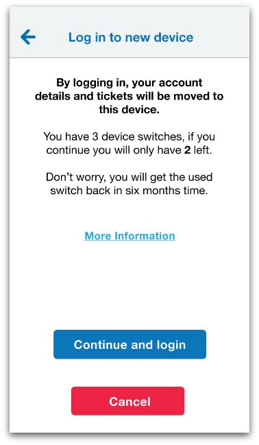
Our work had paid off. Our testers (a mix of people who tested this last week and new users) now understood enough to be happy to continue. They did not know the full ins and outs but they did not need to. All they needed to know was that it was safe to continue. One final tweak and it was ready to go.
This is a tiny part of our app. It probably will not even be seen that often, but I am now happy that when it is seen it will help our customers feel confident in moving forward rather than creating the panic and confusion of the first message.
Key take always: Test. And test again. If you know your subject well you will assume knowledge your customer probably does not have. The only way to see the gaps is to test. As someone on Twitter said “If you know enough to say it’s correct, you know too much to say it’s clear. No one can judge both clear and correct.”
And remember small projects are likely to need the same amounts of work as large projects if not more.