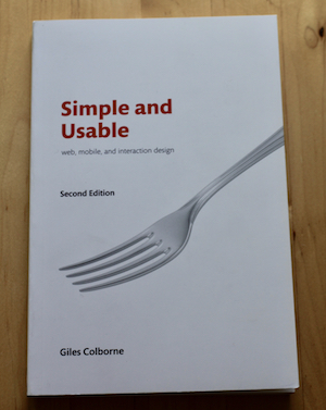
Book Review - Simple and Usable
I think everyone, whether they are anything to do with UX or not, has come across something and wondered why it has to be so complicated, just look at a standard TV remote control or DVD player.
While everything in our lives has been designed to some extent, it is not always with the user in mind, or at least with the mainstream user in mind, which means that things can get complicated really quickly.

Although simple things might look like they are easy to design they are actually very hard to design well. There are always more features that could be added, and choice for the user is good, right?
This is where Giles Colborne’s book ‘Simple and Usable’ comes in. He looks at how to design something that is both simple and usable using the TV remote as an example.
He actually splits it into 4 possible strategies.
- Remove. Take away all the stuff that your user will not need.
- Organise. Put relevant things together to help people find and use things.
- Hide. Use menus, or in the case of the TV remote a little door, to hide away the things people do not use very often.
- Displace. Only show things in the relevant place, for instance a smart watch cannot do the same things a website can.
Of course you do not have to use just one of these strategies, mixing them together can make them even more powerful.
On top of all this, Giles’ book is a model of simplicity, keeping to one concept per page and keeping away from jargon, making it a very straightforward read. But there is a lot of power in this book and while it might have been written with simplicity in mind it is not simplistic.
This is a must read for anyone who has to design anything, whether it be a physical thing like a TV remote or a digital product, even if the thing you are designing seems like the most simple thing in the world. Complexity will soon creep in.
