Temporary Able Bodied (TAB)
So far in my life I have been incredibly lucky. Except for a short stay in hospital when I was 10 I have always been fit and healthy and able to do anything I set my mind to. But I realise this will not always be the case as I get older.
So it was with interest I recently read an article where the author gave the title Temporary Able Bodied (TAB) to describe most of their users. As they said, you might be young, fit and healthy with perfect sight now, but that will not always be the case. It could be as simple as braking your arm so you can not use the mouse on your computer, or as devastating as losing your sight, but things do and will change.
Which is why I believe it is so important that we consider these things when we create digital products. These websites and apps are after all supposed to make life better, but if you exclude people who are no longer Able Bodied for whatever reason, you are actually making things a lot worse for them as they are likely to be people who are already isolated.
"When you design or create your next digital product try and make it for the future you"
If you have just lost your sight are you really going to feel confident going to a supermarket and doing your weekly shop? I know I would not. But if I knew I could still visit that supermarket via a website and order my food there, it is going to help my confidence and my independence when I do not have to ask someone else to do it for me.
I believe the main problem, and this is a problem I have had too, is that HTML and CSS are fairly easy to learn, and without too much effort you can create a website which works and looks ok. And some accessibility features are easy to do like making sure all images have alt text. But then you cross into the slightly more complicated stuff like ARIA which makes it a little more tricky for the beginner to make their site 100% accessible.
Of course for bigger companies with a team of developers, that side of things should not be an issue. The problem there is having the time and inclination to do the work.
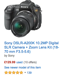
But all of us should at least be thinking about the content of our sites. I recently looked at an Amazon listing page using a screen reader (this is software which will read out the content of a webpage) and although it did ok, when it got to the star rating for each product it just gave this random number with no reference to stars. If you can not see the stars you will have no idea what that number is for.

Of course for an TAB person with perfect vision, until you have heard a screen reader miss something you would have no idea there was an issue.
I would really recommend listening to your site with a screen reader, it is easy to do, just load your site on an iPad or Mac and turn on VoiceOver (Android has TalkBack). It will probably show you a few small things which you could do to improve the experience for a wide range of people. Remember it is not just blind people who use a screen reader, anyone with visibility issues will find one handy.
So when you design or create your next digital product try and make it for the future you, the one who is not fit and healthy with perfect sight. You will thank yourself later.
NOTE: A week or so after writing this post I came across Anne Gibson's An Alphabet of Accessibility Issues and just had to share it here as I think it highlights some of that I said above perfectly.
