Onboarding
As a UX designer I am very aware of the importance of onboarding your user. This was most important at my last job where I was working on a ticketing app, but is still important at my current job in retail, even if it is different.

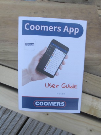
So I could not help but be interested when my husband came home last week with an actual printed set of instructions for the app the local builders merchants have just released.
Being so involved in tech as I am this seemed preposterous to me! A printed booklet for using an app! How ridiculous! But the more I thought about it, the more I started to think that maybe they had done the right thing.
The app itself will allow you to order items and see invoices, amongst other things, which is very useful. It means my husband should be able to complete quotes for customers in the evening, rather than having to wait until the morning to ring the builders merchants for prices, depending on what job he is working on and if he has a mobile signal. It also means making sure he has a pen and paper for making notes while talking to them and then getting that bit of paper (which is probably the back of a receipt for fencing from the last job) home to add those figures to the half completed quote from the night before.
Having had a play with it, the app seems to work quite well and both being quite familiar with how apps work neither of us looked at the instructions.
However when I started thinking about some of the people we know who would in theory use this app it occurred to me that quite a lot of them would not be familiar with apps, and might be put off trying it because they don’t know where to start.
Even just getting the app onto your device could be hard if you have not downloaded one before.
There are a bunch of chaps (and they will mostly be chaps) who are busy and will not waste time with something they cannot get to work. They might not even use the app that often so remembering what each bit does or how to get to things will be hard too. At least with a print out they can have a quick reminder when they get stuck, assuming they do not lose it.
I think this is a really good example of thinking about your audience and not just making assumptions, which is something those of us working on these things should do more of.
