Designing for Multiple Devices
This week I was back with General Assembly for an evening class. Although I have spent a good number of years working on websites, and considering I am now working on mobile apps, I know there is still much more I can learn about designing for devices. So when I saw the class 'Designing for Multiple Devices' I thought it might be a good way to improve my knowledge, especially as this seems to be the way technology is moving now.
I work in a small design team with Flavio and Joe and when I told them what I had just signed up for they thought it sounded interesting so they signed up too.
We arrived at Second Home in good time and got settled in for the 3 hour class.
The class was split into 3 parts, and was led by Anna Dahlström, who was very knowledgeable.
The first part introduced the idea of designing for multiple devices and covered subjects such as when to make your website responsive (always) and when to build an app.
Some of this I knew already. For instance:
- people are likely to use several different devices to complete a task,
- or use several devices to complement each other, for instance watching TV and using your phone to look up stuff you saw on the programme,
- or just using both at the same time, unrelated to each other.
- or the idea that people are very likely to use their phones to buy things now compared with just a few years ago.
But it also covered things that I did not know, for instance the average user looks at their phone 150 times a day!
The second part looked at how you might tackle designing a site which must look good on both a huge iMac screen, a tiny Android device and everything in between. And what about that pesky Apple Watch?

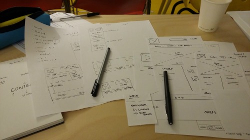
We drew sketches showing how we might make content into blocks. Then we thought about how we might change the navigation as the screen size decreases. So many choices and all have pros and cons depending on the type of device and content.
We also thought about what content we might put in an app to complement a website. This meant thinking about why the user would use an app instead of visiting a website - maybe the need for push notifications or locational help when on the move.
"Make your website future friendly rather than future proof"
In the last section we got into more depth about layouts and thinking about how these change not just for different screen sizes but also depending on if the device has a touch screen or not.
After all if you think about it you do not always hold your device the same way, it depends on what you are doing and where as much as anything. For instance if you are watching a film at home you will turn your device landscape.
All in all I found this a really enjoyable session with a good mix of information and practice. The time flew by and I was shocked to find we had finished already. We did cover subjects and information that I was already aware of, but we also covered new things and adding the two together has increased to my overall knowledge. I had been a bit worried that my colleagues might find it a bit basic as they have been working on mobile for a while now, but they both enjoyed it and it sparked off several conversations and ideas about how we could improve our apps in the future. That can not be a bad thing.
The overall message was to make your website future friendly rather than future proof, after all it is better to make a site which can cope with many different screen sizes, rather than trying to guess what the future might hold.
