Kicking Off a Project
The next project the team will be working on is the product listing page. It is not my project, but I will be keeping an eye on Emma and offering support, as she leads her first project at Wiggle.
She has done lots of research already, but now it is time to get the project team thinking about the project and what we want to focus on.

To start this Emma set up two workshops to be attended by anyone involved in the project including the Product Owner, Business Analyst and UI Developer.
The first workshop was called a Noticeability Workshop or NB workshop as noticeability gets a bit hard to say when you keep using it.
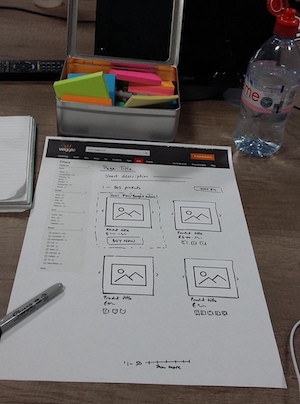
The point of this workshop is to see what parts of the page people can remember, the idea being they will only remember the really important things. Everyone had been asked to look at the Wiggle listing pages and any listing pages from their favorite shops before coming to the session.
Emma had supplied cut out images in two different sizes along with sharpies, scissors, glue and extra paper. Then we had 15 minutes to answer the questions - what you would expect to find on a listing page?
Although people were a little hesitant to start, once they had put pen to paper everyone seemed to quite enjoy the session.
As you can imagine there is only so much to can do with a listing page, but there was still some excellent ideas and it was fascinating to see what people did remember.
With the designs on the wall Emma led the group through a discussion round their designs and how they use these pages while I scribbled notes to be typed up later.
The next day Emma ran her second workshop, with a similar group of people. This time it was a competitor analysis, something she had already done for a large selection of competitors and other shops.

The idea this time was to get the team talking about other companies pages, what they liked, what they disliked and what were the most important parts.
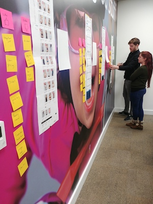
With the listing pages of four different sites printed out and stuck on the wall and the group split into two teams she asked them to write post-it notes indicating what they liked or disliked about each page.
It was interesting to note how while one team liked something the other team might not, showing just how subjective design can be.
With all four sites critiqued they discussed their thoughts while I again scribbled notes. The discussion was very different this time, focusing on very different parts of the page, but once again fascinating.
Both sessions went really well and I think everyone enjoyed not being in a regular meeting! It was a great way to get the team thinking about the next project and to get some interesting feedback from them. I think we have a much better idea of what the Product Owner is expecting now than we did before.
It is now up to Emma to look at her findings, along with all the other research she has done to start working out where the problems are and what we should focus on.
