Guerilla Testing
After months of working on improving the Wiggle website navigation it was time to test it with real users. This is the part of my job I love the most, but get to do the least.
I have already run card sorting sessions to find out how people think about our products. And I am running Tree Jacks to see if the hierarchy we have designed allows people to find the products they need. The last thing to test was the mega menu and nav bar.
This is one of the most important parts of the site as it appears on every page and helps people to find what they are looking for. Although we know that about 50% of our customers use search to find things, they should also be able to use the navigation too, which then feeds into making the search better.
Having looked at many competitors and knowing our product range much better than I did a couple of months ago, I put together two possible nav bars and a suggestion on the interaction for the mega menu.
The first nav bar is the one favoured by the business which lists all the sports we have products for, but does not give us any room to expand this range without making the menu text dangerously small.
The second, favoured by myself, used a ‘sports’ title for most things giving us room to expand, but pulls out the popular categories like Clothing, Nutrition and Tech to help people find popular products fast.
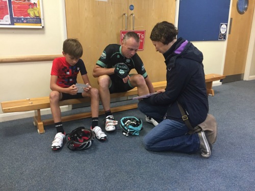
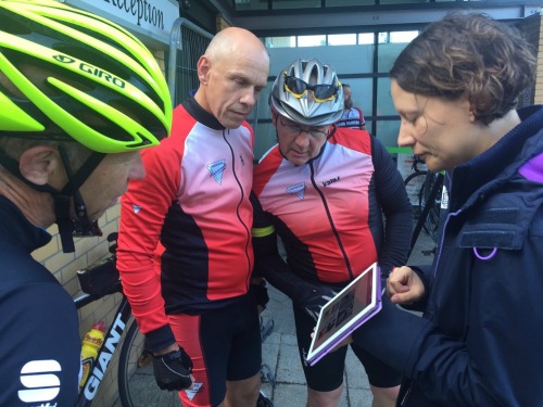
Wiggle do not just sell sports goods, they also run events across the country, so last weekend Helen, my manager, and myself got up really early so we could be at a sportive event start to speak to our customers as they got ready to cycle round the local countryside on Sunday morning.
We found the coffee queue was the perfect place to speak to people as they had nothing else to do as they waited and did not mind speaking to us.
As we wanted to test which nav bar and mega menu we should create, I had made a very rough prototype in Keynote which I then had on my iPad. This allowed people to feel like it was a proper website and us to test not just the words we were using but the interaction too.
In the couple of hours before everyone had set off we managed to speak to about 20 people and watch them use our menus to find energy gels, a bike computer, a cycle jersey and an inner tube.
The best thing was finding that both menus worked really well. But the test also showed us where we could improve and gave us arguments for and against both. It is so great to test something and have it validated. For instance there had been a lot of discussion within the project team about the word Tech. Under this you can find anything from bike computers, GPS watches and headphones which is why a lot of the words discussed would not work. So to ask people to find a bike computer and have them all go via Tech was great.
Now we have this research and the last of the tree jack results coming in, we should be able to make the last changes and present our findings to our stakeholders.
Then it is just a case of building it!