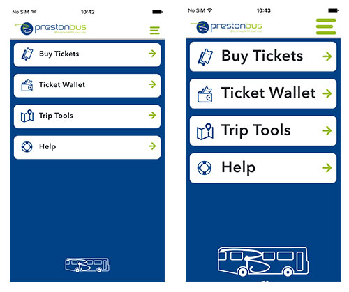
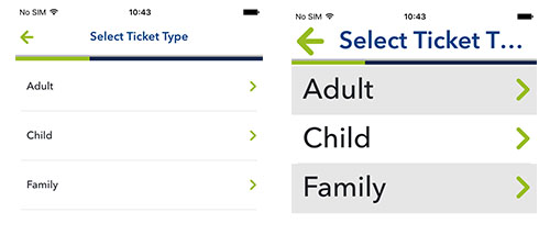
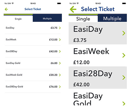
Enlarged Text
When I was first asked to look at the accessibility of our products I started by researching accessibility in apps.
Some things are pretty obvious, like making sure it can be used by a screen reader for someone with a visual impairment, to the less obvious like not asking your user to remember information between screens, a particular problem for those with cognitive issues.

I then set about testing our products. We had recently released version 3 of our app and I started with the very basics - could I increase the size of the text within the app. This is normally done within the settings of the phone and to my surprise changing this setting did nothing in the app.
Talking to the team I found out the option was there within the app, but it had been turned off!
When it had been turned on it had made such a mess of the app, with text overlapping and being unreadable, that it had been decided that it was just best turned off and dealt with later. It is after all a small team and there with many other things to deal with to at least get the app launched.
Now that the app was live there was finally some time and resource to fix the issue.

The first thing to do was to go through the screens of the app in the enlarged state to see what the problems were.
It was messy, but it did work. With some help from Joe our UI designer and Löic one of our front end developers we were able to make subtle changes to the design when in enlarged state to make sure text did not overlap other text and buttons could still be read and used.

With just a couple of days work and some collaboration between teams we now have an app that visually impaired people can use. There is still some work to do, the screen readers still do not work that well but just by improving one thing we have increased the potential audience to our product and increased awareness within the company.
