Compromises and Constraints
With our app live in LA, people could now buy tickets on our app to travel on the train. But how would they get home from the station? This question prompted Metrolink to ask for links within the app for Uber and Lyft and space for anything else that might become an option in the future.
With no opportunity to suggest that these buttons would end up so hidden within the app that anyone who needs these services would just go to the appropriate app on their phone, I set about making the experience the best I could for those who might actually find it.

The feature had been named ‘last mile handover’ within the company, but this would not mean much to our users and hinted at a solution before design had had a chance to look at the problem.
When I started thinking about when you might need this service I realised that this was not just about getting people home. Maybe they would be going to the office or maybe they would be going in the other direction - home or work to the station!

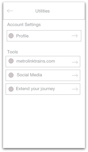
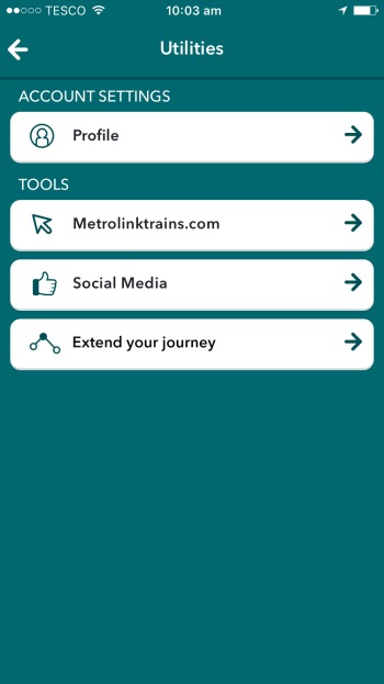
Suddenly it was not about the last mile anymore, it was about the whole journey. After playing around with a title I settled on ‘Extend your journey’. This seemed to cover both ends of the journey and allowed for other modes of transport later if needed.
Placement of the section was easier due to there already being a Tools section within the app and then all it needed was some design from Joe our UI designer.

From this small project I learnt that sometimes although a feature does not necessarily make sense to you, you have no choice but to work on it. In this case it is a nice idea (with, I am sure some revenue deal behind it), but I feel unnecessary. However it does not affect the app too much, or hurt anyone to include it and so I did my best to make it a useable feature.
If I had thought it affected the usability of the app then I would have felt the need to take a stand and to get a discussion going so that some sort of compromise could be agreed on.

These sort of compromises and constraints are not always obvious from the outside but the more I encounter them myself the more I appreciate that the services I use that have, what I consider to be, strange design choices may well have had similar issues.
