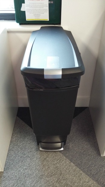
The Bin
We have recently moved into a new office. It is very nice (and much better than where we were) but it is taking a little while to sort ourselves out. After all it is not just about unpacking the things we bought with us, but getting used to a new layout and new furniture as we have more room now.
While I have very much been enjoying looking out of the window (we were in a basement before) I have also found watching my colleagues use the new bin fascinating too. I realise this makes me sound a little crazy, but it is a UX thing.
Let me explain - behind where I sit there is a big empty space, a massive white board, an ice cream freezer, the sweet dispensers and a bin. There was talk of a sofa too but I have not seen one.

It is a nice new shiny bin. I had no idea how fascinating it would become when it turned up one morning, nicely slotted in beside the sweets.
The first problem was people just were not seeing it. We have a bin under our desk and people were still trying to use that until we pointed out the new bin. I know it is black but are people really that unobservant? I saw it as soon as it arrived (I did not see it delivered).
And then there is the funny way people cannot work out how to open it. It uses a foot pedal like the majority of bins (except the ones under desks and recycling bins) round the office, and yet I have watched many people struggle with this simple concept.
The fact it has some sort of lock to stop your pets getting in to it is not helping matters as people think it is a button for opening it.
"Just because something seems pretty obvious when you design it, does not mean it will seem that way to your users"
So maybe the context is throwing people off. It looks like the sort of bin you would have in a kitchen, but it is not in a kitchen and all the other pedal bins are in the loos.
Or maybe it is the fact that they are normally being distracted a little by the Design Team as we chat with people (it is like they have come to visit us).
Or maybe it is the fear that they are about to drop a handful of sweets/peanuts, because they forgot to bring their pot up with them, all over the lovely new carpet.
I guess what I am trying to say is that just because something seems pretty obvious when you design it, does not mean it will seem that way to your users. They might be trying to juggle other things like a handful of sweets and a cornetto while trying to use your product.
We can not design to take into account every situation (although we can try), but maybe just an understanding of the sorts of things our user might be doing at the same time as using our product might help. This is where research or simple observation of your user comes in.
