Apple Watch
I like Apple. I think their products are good and their marketing done well. I have a MacBook Pro and an iPad and I love them both.
However I feel no need for an iPhone or Apple Watch. For starters the price puts me off, these are after all devices which are going to get the most wear and tear and yet are pretty delicate. I am more than happy with my Samsung A3. Then there is the fact I have not worn a watch for maybe 10 years and do not really feel the need to start again now. After all I have a clock on my phone, computer, office wall, cooker, car, etc.
And then there is the fact that I do not like how the devices rule us with their constant "Look at me! Read me now!" How rude. I would like to say I make them wait, but no, I eagerly await the next ping or vibration telling me I have email or that someone posted something on Facebook. Yay.
However with a hackathon day announced at work and Flavio eager to finally start the process to get our apps on to the Apple Watch I had to learn how it all worked before I could even think about designing for it.
I should point out that Flavio and Joe both have Apple Watches and constantly annoy me with their lack of focus as they sit in meetings or during discussions checking their watches for the latest notification. It feels so rude!
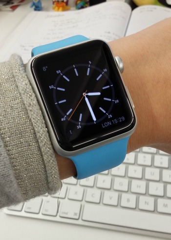
So the company Apple Watch and a suitable iPhone where retrieved and I spent an afternoon trying to set them up so I could test them out for the week leading up to the hackathon. It was not a proper test as I was not logging into all the stuff I really use day to day. Just my company accounts on things like email, trello, hipchat and twitter so I could see how the notifications and interactions work.
I was also not taking it home so not having the full experience, which was a shame as I was interested in how the activity tracker worked, but hopefully I would learn enough.
First though we had to get the Watch to show notifications. For a system which is supposed to be intuitive and easy to use it took another day and a half of fiddling to get it working. That might in part be because I was using work devices so not fully set up for me (and without a phone number), but it was still a lot harder than I had thought it would be and took both Joe and Flavio's help to get it sorted.
"We found the best thing was to map out a user journey which made it a lot easier to think about what should be on your wrist and what should be in your pocket."
And then the notifications started.
It is hugely distracting to have this thing on your wrist trying to get your attention constantly. It made me jump every time! And I only had it set up for a few things to get a feel for how it works. I can not imagine how much more annoying it would be if everything was set up. Of course I know you can turn notifications off but if the point is that it tells you when something is happening, you are not really going to turn any of them off are you?
I found it really hard to remain focused when I had something begging for my attention every time an email came through so at least I now understand why Flavio and Joe are constantly checking theirs, even if I still think it is rude.
I am also not sure I like being told to stand up by my watch. This is part of its daily activity/health and fitness companion thingy. After all if I am drinking enough I have a bladder which should do the job for me! (Don't try and hold it in)
To be honest I had stopped wearing it before the week was up, although I did continue to play with it as we thought about how our apps might work and looked at how competitors had built theirs.
And looking at how other apps worked on the watch was a great way to see what would work for us. The trick really is to keep it simple. As soon as you add too much it gets really confusing to the user as to where they are and what they can do. Adding the force touch functionality does give you extra scope but does depend on the user thinking to try it, as there is no indicator as to which screens this will work on and is different for every app. (Force touch needs a blog post all of its own.)
To design for the watch you really have to think about why your user would be using it in the first place. We found the best thing was to map out a user journey and split the activitys between the iPhone and Watch. This made it a lot easier to think about what should be on your wrist and what should be in your pocket. By the end of the hack day we did have a first design. Who knows if it will ever be made.
It was an interesting experience and I am glad I got the chance to try it out, but it has not convinced me to go out and get one. After all if advocates like Flavio and Joe do not love/need it enough to remember to charge it every night (their Watches quite often just sit on their desks charging during the day) I do not think this is a device you can not live without. I know these sorts of devices are the sort of thing we dream about from childhood, but I think the Apple Watch has a while to go before it meets our full expectations.
Want to know what other people think? Check out the funny Elder React video. It might be funny but they make some really great points - this is why we should always test our products with a variety of users.